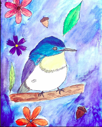
 This is a watercolor drawing of a bird with flowers and acorns and leaves. I thought it was cool because it was colorful, and I really like the texture of the background and I like how blue the bird is. I wish I didn't do the flowers and acorns and stuff because it's a little weird and not that cool anymore.
0 Comments
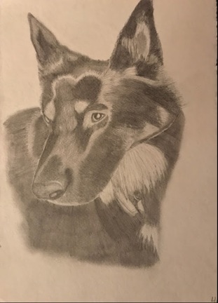 This is a drawing of Spud, Baxter's dog. I thought it would be cool to try and draw him because there was a point of time around December where his dog ran away for a week and their whole family was stressed and scared about the whole situation, and so was I honestly because I am so close with all of them. After he came back and we found out he was alive and took him to the hospital for his wounds, I thought it would be a good idea to draw him. This was interesting because I have never drawn an animal before, and I also drew him on watercolor paper which has an interesting texture, and it made it a lot easier to draw the texture in his fur. Overall, I am really proud of this drawing. 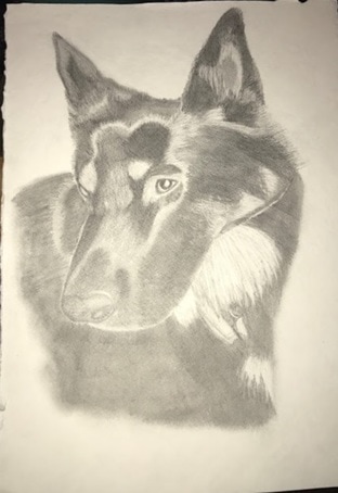 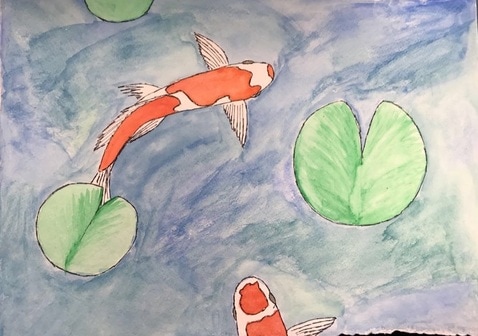 I did a watercolor painting of a Koi Fish Pond because I thought it would be kind of cute to do something with a koi fish and watercolor, because fish are cute. I like the way I did the water. It doesn't really look like water, but the texture of it is really cool. And I like how it's a kind of blue-green color. I want to advance more in watercolor and explore more with different techniques and trying to paint without outlining things in sharpie someday.
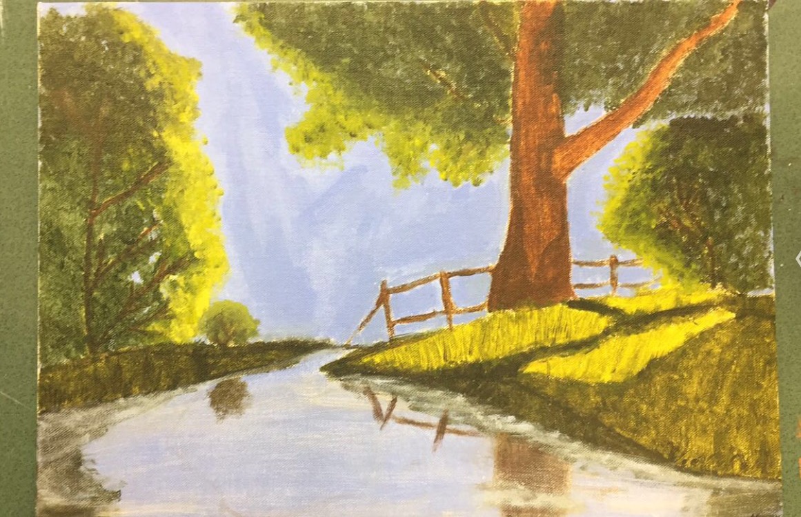 This is an acrylic painting of woods. It was really hard for me to do because I didn't really know what I was doing. I watched a ton of Bob Ross videos to get some insight, but I also put my own creative technique into creating some of the texture, especially with the leaves and the grass. The photo makes the colors look somewhat off.
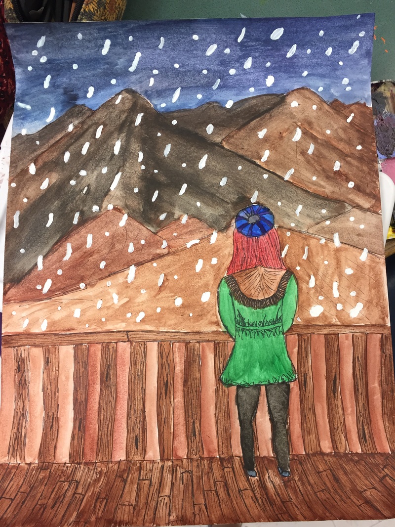
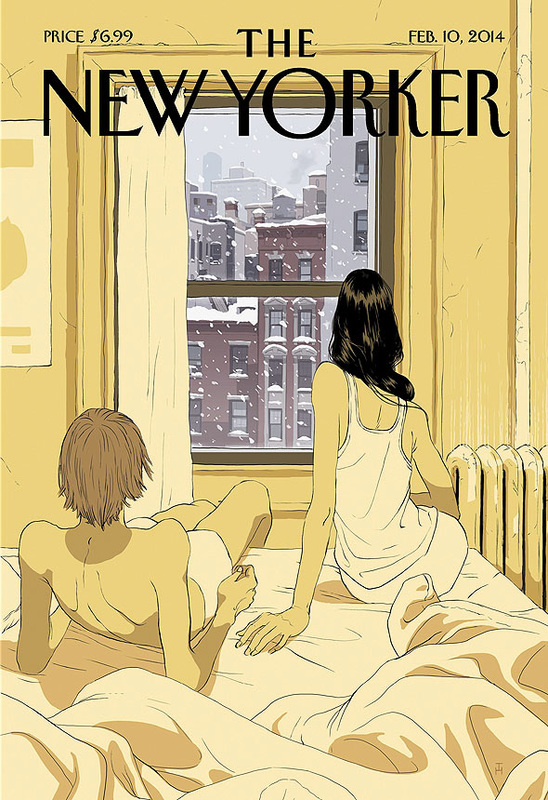
This is my cover for the New Yorker. The one on the right is by the original artist, Tomer Hanuka. Obviously it's animated and digitally produced, which made it really hard to create something similar. For Hauka's cover, he said that the reason purpose behind it was to depict the nostalgic feelings that snow brings. So, in my portrait, I decided to make a red-headed girl staring out at a snowfall that is about to cover a set of mountains. With the watercolors I had, it was really hard to create a diverse set of a colors that reflected the depth of the mountains and differentiated the wooden porch from the brown mountains. But, I was able to make some black-brown mountains, red-brown mountains, and light brown mountains that almost remind me of the colors of the Grand Canyon. I also used a fine point sharpie to outline everything. I thought it would be similar to the black lines used in Hanuka's cover.
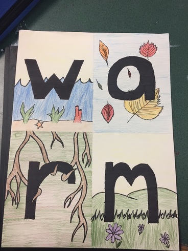 I decided to use the word "warm" for my four letter word because I really enjoy warm weather. Instead of doing it all black and white, I decided to make the letters solid black and then have entirely colorful backgrounds. I thought it would be a good transition. I did water to represent w, autumn to represent a, roots to represent r, and meadow to represent m. I did all of these because I believe they equate to warm weather and they are all part of things that make me happy.
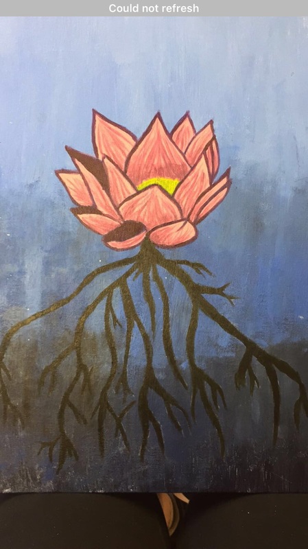 This is my future self portrait. I painted this lotus flower with acrylic paint. I made a gradient in the background and then drew the flower and roots with white charcoal before painting it. I chose to do a lotus flower because I believe that I have not reached my full potential and that someday I will become reborn and I will be new and able to achieve my full potential. I want to transcend into my full self someday.
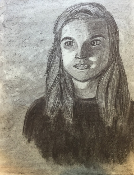
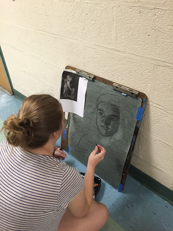
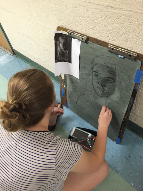
This is my charcoal portrait. I drew Kylie, and not from a live model. I learned while drawing this that using charcoal is really hard, especially when making small details. I learned that I should start with the bigger details and then move onto the smaller details. I also learned that charcoal and erasers are very good for shadows and highlights.
 This is my Blind Contour portrait. I learned throughout this process that it's very freeing to draw something that's not supposed to be perfect, because art is not supposed to be perfect. I also learned a lot about color as well and how colors look good together. I also learned about negative space and how that affects a drawing.
|
AuthorWrite something about yourself. No need to be fancy, just an overview. Archives
March 2017
Categories |
 RSS Feed
